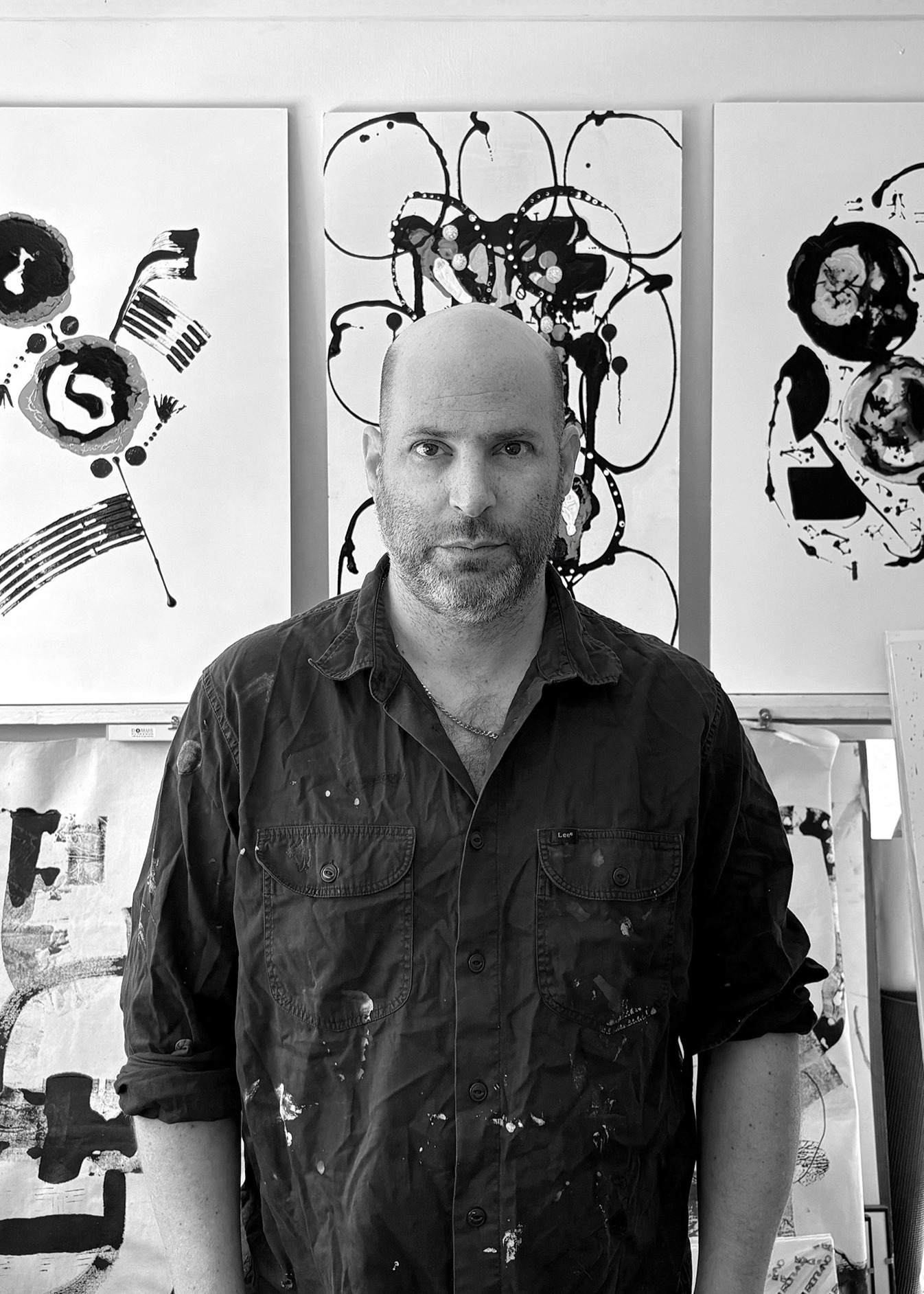


BIOGRAPHY
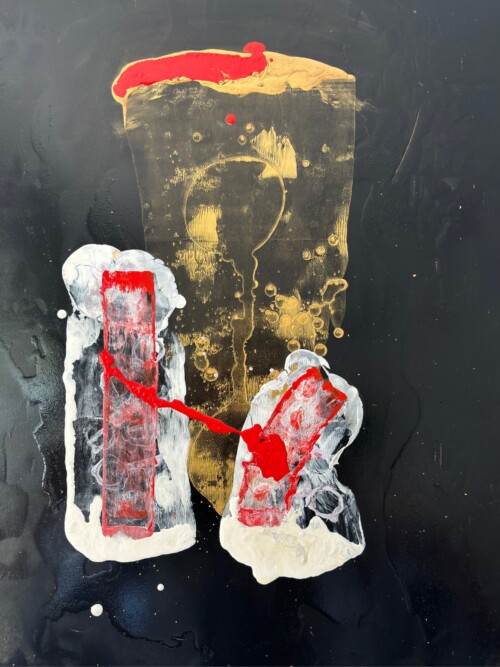
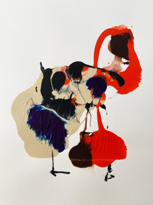
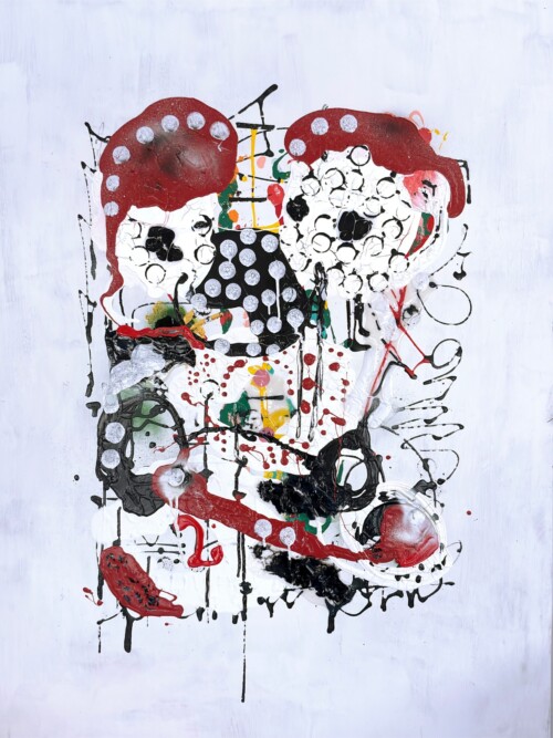
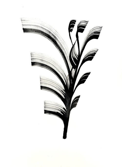
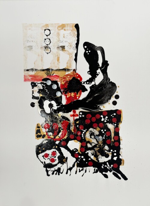
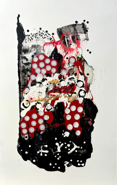
Itamar Heifetz is an Israeli artist specializing in painting and typography. His work is known for bold colors, expressive brushstrokes, and a dynamic interplay of abstract, surreal, and dreamlike elements. Heifetz incorporates handmade typography with calligraphic and experimental lettering, giving his pieces a unique symbolic depth.
He studied film at The New School in 2001, followed by printmaking and graphic design at the School of Visual Arts from 2004 to 2005. From 2008 to 2015, Heifetz worked as a brand designer and a special designer for typography. Since 2015, he has focused on design for cultural projects and book design. He is also the art director of “Seshat Publishing,” specializing in children’s picture books.
CV
Exhibitions
La Cultue, solo exhibition TLV, 2021
Uriel Gallery, Group exhibition,TLV, 2022
Monsters, Group exhibition, TLV, 2022
La culture, Group exhibition, TLV 2023
dfus hozer, Group exhibition, TLV, 2023
Words of hope,Group exhibition, TLV, 2023
Boo Magazine, solo artist, 2024
Gallery Azur, Group exhibition, Berlin, 2024
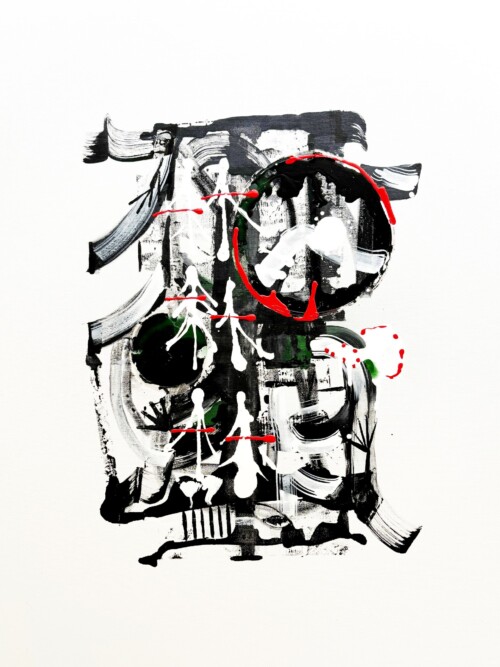
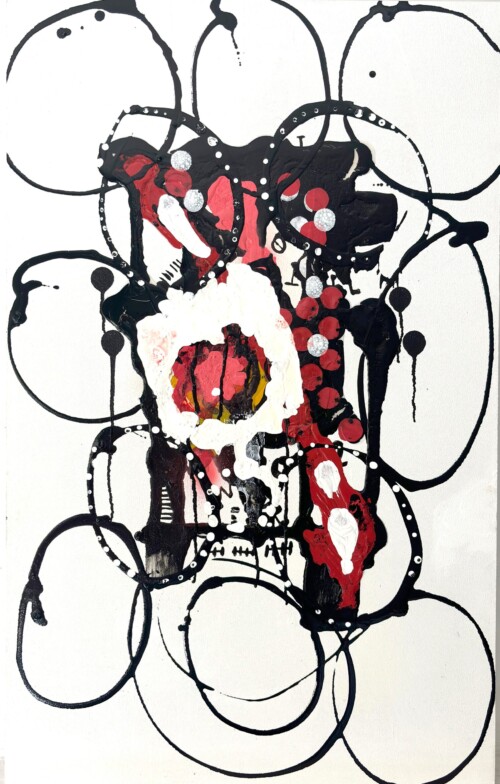
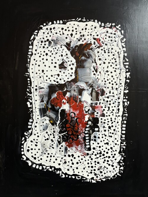
STATEMENT
At the heart of my work lies Hebrew typography, serving as a visual base and bridge between the emotional and material worlds.
I ask questions about the boundaries of typography: How far can I “liberate” letters, words, and symbols from their conventional visual structure while maintaining fundamental principles like flow, systematic composition, and repetition? Can typography become a universal form that transcends the limits of history and culture?
Deconstructing language into symbolic and primal elements and reconstructing them into a “language” creates new structures and system. This play between a graphic/typographic base and abstract expression generates an organic structures that not only can form words and letters but also carries an energetic base allowing me to infuse emotional content hidden behind the words.
Despite this expansion, I remain rooted in the ancient structure of Hebrew and its typographic principles, where each word invites creative experimentation and play in the formation of new shapes. The raw combination of letters and brushstrokes creates a new base that is trying to connect to a more primal emotion, which I seek to reveal to myself and others.